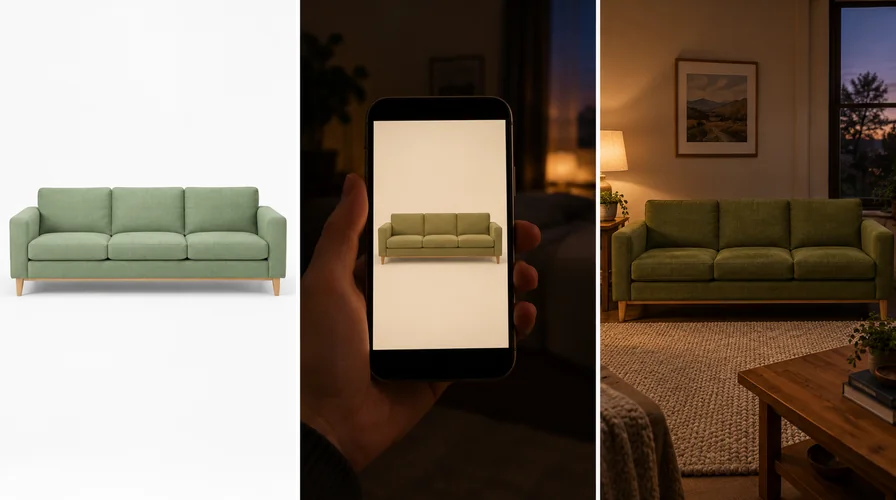
 Same sofa, three conditions
Furniture colors look different online vs in person because a listing photo is lit and finished for a catalog, then shown to you on a screen that makes its own light, and finally judged in a room full of lamps, daylight and colored surfaces that were never part of the shoot. Nothing has to go wrong for the tone to shift. DecorViz closes that gap: you upload a photo of your room and the product image from the listing, and the preview shows that product in your space using the color from the image you supplied.
DecorViz works from an image, not a catalog, so the store does not have to support anything. If you can save the product photo, you can see it in your room.
Key points
- A catalog photo is shot under controlled, neutral light. Your home is not neutral.
- Your screen emits light. Fabric and wood reflect it. That alone shifts the same file between devices.
- Walls, floors and the rug already in the room push color around once the piece arrives.
- DecorViz builds the preview from the listing photo you upload, so the color you judge is the product's own.
- Any store, any brand, any independent shop. A product image is the only requirement.
Why do furniture colors look different online vs in person?
Four separate things act on a color between the studio floor and your living room. They stack, which is why a small shift at each stage adds up to a sofa that feels like the wrong grey.
Studio light is neutral on purpose
Retail photography uses even, directional light and a careful white balance so a whole catalog looks consistent. Your apartment has warm bulbs, a north window, and a lamp you only switch on at night.
The file is finished for the page
White balance, contrast and saturation are set so the piece reads clearly beside every other product on the site. That finished file is the image shoppers actually see and save.
Your screen makes its own version
A display emits light rather than reflecting it. Brightness, panel type and night shift all push the same file warmer or cooler before your eyes reach it.
Your room answers back
A terracotta rug, a yellow-white wall and an oak floor all bounce color onto whatever sits near them. The piece is not lit in isolation once it is home.
None of this means a retailer is hiding something. It means a white-backdrop listing photo, on its own, is a weak basis for a color decision.
What a listing photo does to a color before you ever see it
Product photography has a job, and that job is not to predict your apartment. It is to show the piece clearly, consistently, and the same way as every other item in the catalog.
Even light softens the depth cues
Balanced lighting reduces deep shadow. That flatters a weave or a wood grain, but it also removes contrast your eye normally uses to read how dark a tone really is.
The backdrop gives no reference
A pure white or pale grey seamless is the whole point of a catalog shot. It also means you have nothing familiar beside the piece to judge its undertone against.
Colorways are shown as a family
The sage, the olive and the moss in one range are presented so they read as a coherent set on the product page. Their real separation in a room can be wider than the thumbnails suggest.
Lifestyle shots are a styled room
The set beside the sofa was chosen to flatter it. Those walls, that rug and that light are doing work your own room will not repeat.
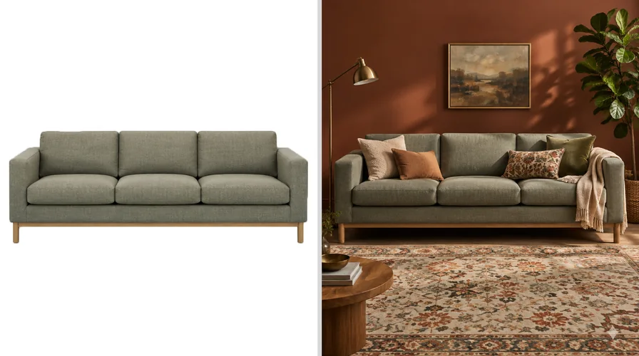 How the same sofa is photographed
Catalog cut-out
Styled lifestyle set
How the same sofa is photographed
Catalog cut-out
Styled lifestyle set
The cut-out gives you no reference. The lifestyle shot gives you someone else's reference. Both are the same sofa.
The tab-hopping trap
Opening the same sofa in four browser tabs and squinting between them does not add information. Every tab is the same finished file on the same screen. New evidence only arrives when that file is put next to something real.
What your screen adds on top of that
This is the layer most shoppers never account for. A sofa in a showroom reflects the light around it. A sofa on your laptop is light, generated by a panel with its own idea of white.
Run the quickest possible test. Open the same product page on your phone and your laptop, side by side, at the same moment. If the two tones do not match each other, neither one is a reliable answer on its own.
Auto-brightness keeps moving
The same listing looks different on the train and on the sofa at night, because the phone is adjusting to the room you are sitting in, not to the sofa you are buying.
Night shift warms everything
Evening color-temperature modes pull the whole display toward amber. A cool grey can read as beige at 11pm on the exact screen that showed it neutrally at noon.
Putting the listing color into your own room
The fix is not a better listing photo. It is a second image: yours. Once the product photo and your room photo are in the same picture, the color stops being abstract.
DecorViz is the path for that. It takes two images and returns one.
Upload a photo of your room
Your walls, your floor, your light. Shoot it in the light you actually live with, not only at the brightest hour of the day.
Upload the product image from the listing
The photo of the exact colorway you are considering, saved from the store page or taken as a screenshot. Any retailer, any brand, because DecorViz has no catalog to be limited by.
Generate the preview
DecorViz removes the existing furniture in the target area and matches lighting and perspective, so you see the swap rather than the new piece stacked on the old one.
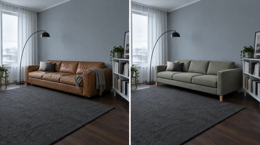 Your room, with the piece swapped
Your room now
With the listing sofa
Your room, with the piece swapped
Your room now
With the listing sofa
The old piece is taken out rather than left behind the new one, and the color you are judging is the one from the listing photo.
The color in a DecorViz preview comes from the product image you upload
DecorViz works from an image, not a product database. The piece you see is the one on the listing, in its own color, material and finish, placed in the room you photographed.
That turns an abstract question into a concrete one. Instead of asking whether "warm oat" is the right name for a color, you are looking at that color sitting against your own wall, next to the chair you are keeping. For the click-by-click version, read how to place furniture in a room using AI.
An AI preview helps you compare a product with your room's palette; it is not a color-calibrated proof or a simulation of how the material reflects your lighting. For a precise color match, check a physical sample in your room in daylight and under your evening lighting.
Listing photo alone vs your room photo plus the listing image
Both start from the same product page. Only one of them gives you evidence about your room.
| Listing photo alone | Room photo plus listing image (DecorViz) | |
|---|---|---|
| What you are looking at | A catalog file on a backlit screen | That same product inside your room photo |
| What you upload | Nothing. You stare at the product page. | Your room photo and the product image |
| Where the color comes from | The retailer's finished file, plus your display | The listing image you supplied |
| Context around the piece | A white or styled backdrop | Your walls, floor, light and existing furniture |
| Comparing two colorways | Tabbing between thumbnails | Same room photo, one product swapped |
| Stores it covers | Whichever tab is open | Any store, any brand, any independent shop |
| Best use | Shortlisting a look | Settling the color before you order |
| What you leave with | An opinion | A picture you can save, compare and send to whoever else has a vote |
Have the listing photo open right now?
Save it, add a photo of the room it is meant for, and see the two together before the color question turns into a return.
A color check to run before you order
Five steps. None of them require you to leave the house.
Save one clean product image per finalist
Front or three-quarter view, the whole piece visible, the correct colorway selected, nothing overlapping it. Skip the heavily styled lifestyle shot if a plain one exists.
Photograph the room in the light you live with
If you read on that sofa at night, take the evening shot too. One room in two light conditions is far more useful than one perfect midday photo.
Preview each finalist in the same room photo
Hold the room constant and change only the product. If the background moves between options, you are no longer comparing colors.
Look at what is next to it, not at it
The question is rarely whether the color is nice. It is whether it fights the rug, the curtains or the wood you are keeping.
Check the listing for everything else
Delivery window, assembly and the returns policy live on the product page, the same as any furniture you buy online.
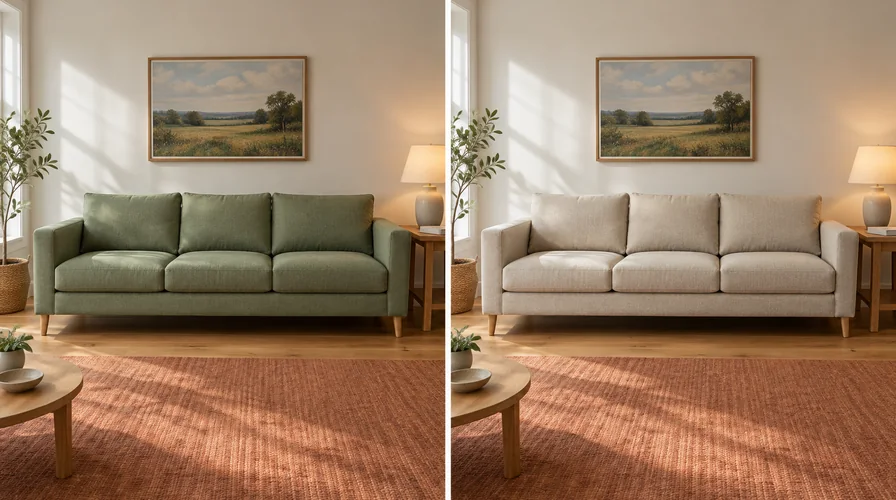 Same room, only the fabric changes
Sage green
Warm oatmeal
Same room, only the fabric changes
Sage green
Warm oatmeal
Hold the room still and swap only the product. Against the same rug and the same wall, the choice usually makes itself.
Where to go next
Color is one part of the decision. Pick the question you are actually stuck on.
Will this exact colorway work in my room?
You have the listing open and want to see it against your own wall and floor.
Why did the piece from the showroom feel wrong at home?
The broader story: staging, spacing and visual mass, not just color.
Store versus home
The color is fine. Does the piece itself suit the room?
Undertone, silhouette and visual weight, worked through as a checklist.
Fit checklist
How much should I trust an AI preview at all?
What the different visualization methods can and cannot settle.
Method accuracy
Frequently Asked Questions
Why do furniture colors look different online vs in person?
A listing photo is lit and finished so the piece reads clearly in a catalog, and you then view that file on a screen that makes its own light. Your home has different lamps, different daylight and colored surfaces nearby.
To close the gap, upload your room photo and that same listing image to DecorViz, which places the product in your room using the color from the image you supplied.
Where does the color in a DecorViz preview come from?
From the product image you upload. DecorViz works from an image rather than a retailer catalog, so the piece in the preview is the one on the listing, in its own color, material and finish.
The preview uses your uploaded product image as a reference, rather than requiring a prebuilt 3D model. AI-generated details and colors can differ from the physical product.
Can I check the color of a product from any store?
Yes. DecorViz needs a product image, not a retailer partnership. A listing photo or a screenshot from a large chain, a boutique or an independent maker all work the same way, so no catalog limits what you can preview.
Why does the same sofa look warmer on my phone than on my laptop?
Screens emit light, while fabric and wood reflect it. Panel type, brightness, auto-brightness and night shift all change how the same file reads.
Comparing one listing on two of your own devices is the quickest way to see how much of the shift is the screen rather than the product.
How do I compare two colorways without confusing myself?
Hold the room constant and change only the product. Preview each colorway in DecorViz against the same room photo, taken in the same light, then put the two results side by side.
Differences you could not name while tabbing between listings become obvious once both sit against the same wall.
Is this the same as why furniture looks different at home?
No. That guide covers showroom staging, spacing and visual mass, which is the broader reason a piece can feel wrong once it arrives.
This page is about color specifically: what a listing photo does to it, what your screen adds, and how to judge that color in your own room with DecorViz before you order.
Stop guessing at the color on your screen
Upload one room photo and one product image. DecorViz previews a real product from any store in your space, with the color taken from the listing photo you supply.
For the wider store-versus-home story, read why furniture looks different at home. When the color family is settled and you need the full fit checklist, open will this furniture look good in my room. For the step-by-step version of the preview itself, see how to place furniture in a room using AI.